Partnered with the Durham Bulls for a meaningful cause by designing a jersey for a competition and auction that benefitted the North Carolina Coalition Against Domestic Violence (NCCADV).
The Art Institute of Raleigh-Durham partnered with the Durham Bulls for a unique, creative project which benefitted a local organization in Durham, NC. Students were asked to design a jersey that would be worn by the Durham Bulls baseball players and auctioned off to raise funds for the North Carolina Coalition Against Domestic Violence. Under the guidance of Fashion Instructor Jessica Palmer and Department Director Aimee Flynn, I was able to create the selected design.
The famous AAA Minor League baseball team, the Durham Bulls, wanted to celebrate their mascot Wool E. Bull’s birthday. The challenge went out to create a special one of a kind jersey that would not only raise money for a charity, but also be worn on game day. This jersey had to be playful and fun, but also creative, with elements that captured the identity of a renowned athletic organization and paid homage to a worthy cause.
After reviewing the challenges, I studied the past jersey designs to see how others approached their concept. After hours of research I found several things which lead me in my final direction.
Starting with the most noticeable, no pervious designer had created a "Retro" jersey. I realized that this could be an interesting direction to take. I liked the idea of designing something that fit the character of the city and the Bulls organization. Both have a rich history and I wanted to show some of that in the design.
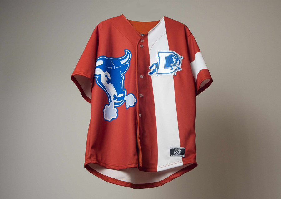
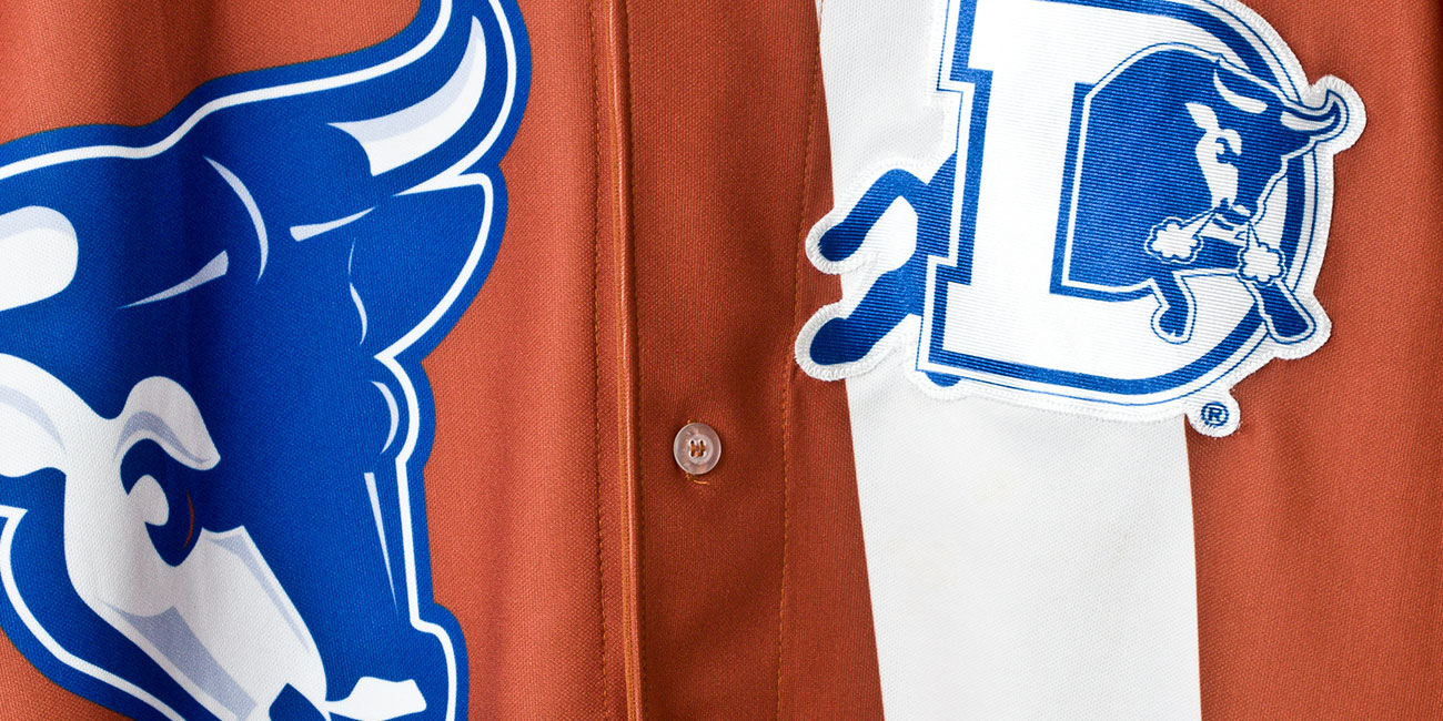
The important elements of consideration were in the color-scheme. Most jerseys from the past were blue, but others of the charity being supported, such as the Autism Society of North Carolina. Since money would be raised through a sports auction however, I wanted to make sure the jersey design stayed focus on the Durham Bulls. This ultimately helped narrow down the color scheme to what was already there, the Durham Bulls colors, which are blue, white, and rustic orange.
Finally, I had to find a way to implement a playful element to the design something which matched the fun and charm trademark of the organization, which would also fit within the framework of a retro style. To do this, I had to draw inspiration from the world of baseball, but even more so from the world of fashion. I researched popular fashion trends from the past such as 60’s mod dresses, which were brought back into style recently. I wanted to weave those “vintage” elements, into an original modern theme.
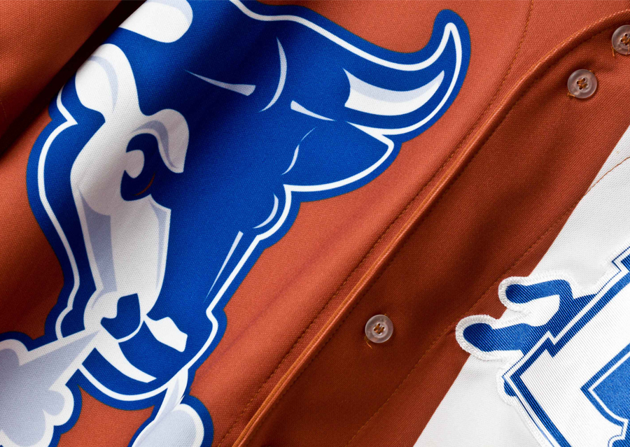
Using this research I was able to come up with a final design. Starting with the sleeve, I was inspired by images of Michael Jackson wearing a band around his arm. The band was meant to symbolize the suffering of the children around the world; a perfect way to incorporate the North Carolina Coalition Against Domestic Violence into the jersey.

The line across the left chest was added to pay homage to the sport of baseball. This is how I incorporated the retro aesthetic inspired by mod dresses of the 60's. The line was placed on the left side of the jersey so as not to clash with the Durham Bulls logo, the location of which was already pre-specified by the organization.

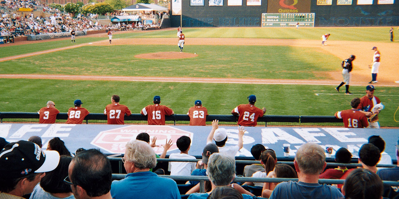
The Durham Bulls logo was added to the right side of the Jersey to help balance the overall look. Along with giving balance, it provides the classic “Bull Durham” Ballpark feel. Regarding color, I knew I was going to stick to the Durham Bulls existing scheme, but did not want to make another blue jersey. Instead, I chose their alternative home scheme, a signature rustic orange as the primary, and white as the secondary to complete the jersey design. Here is the final version of the jersey being worn during the game.